

Report: The Flock Pulse
What this screen is for
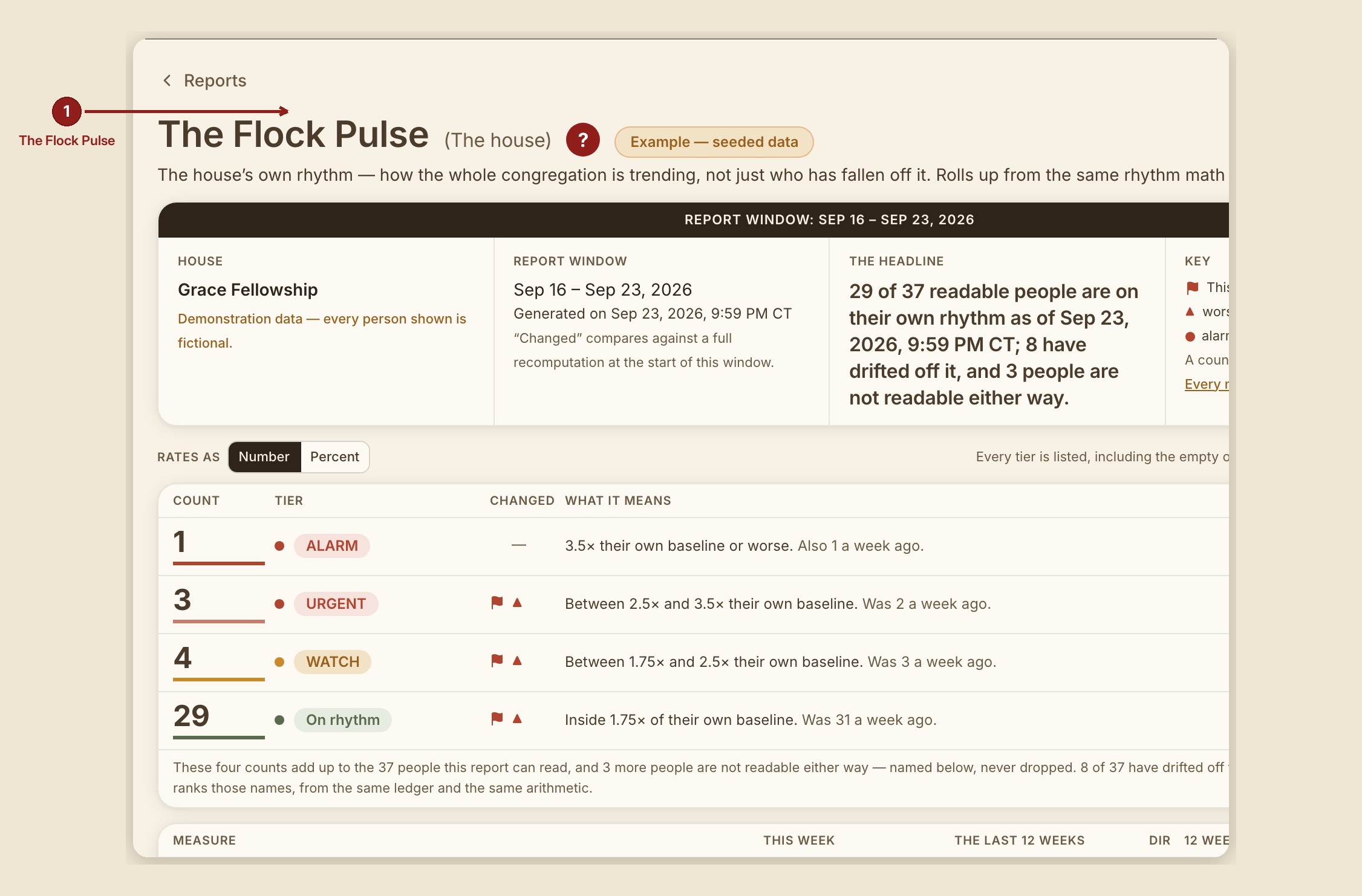
The Flock Pulse (/dashboard/reports/flock-pulse) reads the house's own rhythm as a whole — how the whole congregation is trending, not just who individually has fallen off, as the Shoulder Tap does. The two reports share the same rhythm math on purpose, so they never disagree about the same person.
What you see, in the screen's own labels
- H1 "The Flock Pulse (The house)."
- No scorecard strip. This report's own design note is explicit: "the cohort table IS the scorecard." Four cohort rows — ALARM, URGENT, WATCH, On rhythm — carry the tile treatment instead.
- Cohort row columns: Count · Tier · Changed · What it means.
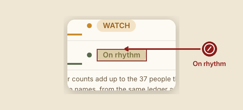
- Tier descriptions, written directly from the same thresholds the Shoulder Tap uses: - ALARM: "3.5× their own baseline or worse." - URGENT: "Between 2.5× and 3.5× their own baseline." - WATCH: "Between 1.75× and 2.5× their own baseline." - On rhythm: "Inside 1.75× of their own baseline."
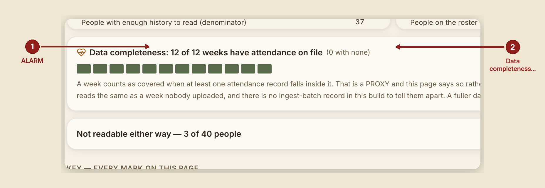
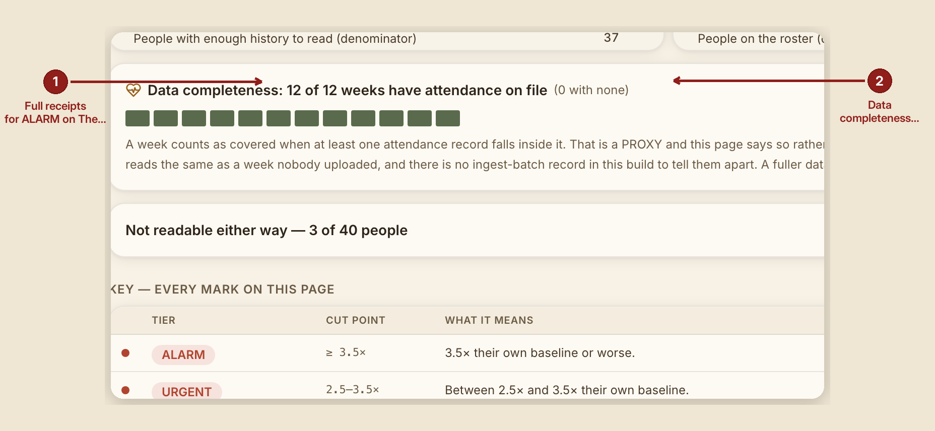
- "Data completeness: {n} of {total} weeks have attendance on file" — a chiclet strip, explicitly flagged in its own Key entry as a proxy measure, not a real ingest signal.
What to do
- Read this report for the shape of the whole house, and drop to the Shoulder Tap when you want the individual names behind a cohort.
- Watch the data-completeness strip as a sanity check on the numbers above it — a house with several blank weeks should read its cohort counts with that gap in mind.
What NOT to do
- Don't read this report as a scorecard on congregation health in the abstract. It measures attendance rhythm specifically, against each person's own baseline — not spiritual health, not engagement in a broader sense.
- Don't expect a sparkline or ranking here. By design, this report is the cohort counts only; individual ranking lives on the Shoulder Tap.
When something goes wrong
- Nobody's on the roster yet: "Nobody is on the roster yet, so there is no house rhythm to read."
- Nobody has two attendance records yet to read a rhythm from: "Nobody on the roster has two attendance records yet, so as of {date} there is no rhythm to read — that is a gap in the ledger, not a healthy house."
- Everyone's on their own rhythm: "The whole house is on its own rhythm — as of {date}, all {n} people with enough history to read are inside their usual gap."
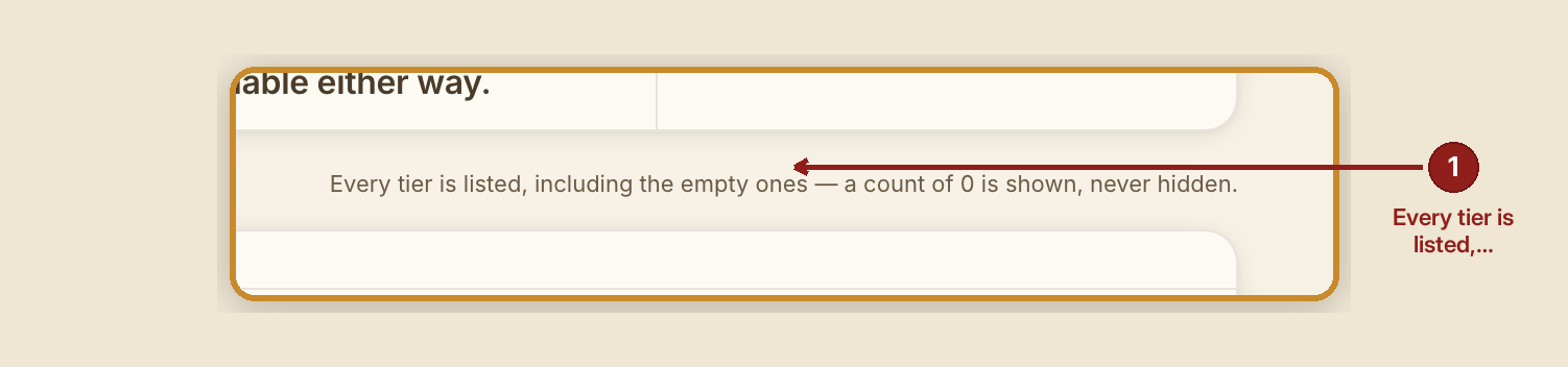
- Nobody has drifted: "0 of {n} readable people have drifted off their own rhythm as of {date} — that is not a bug. The WATCH, URGENT and ALARM rows above are still listed, at zero."